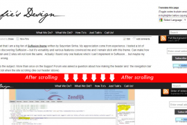
Often, last days, Suffusion users expressed frustration about the look of navigation menus on mobile devices. On small screens the navigation bars of Suffusion are transformed in small, unstyled select
Continue reading... Last days I finished my sister’s site – AtelierIF. Usually I’m not bragging when I finish a website, but this time worth. My sister and her husband are architects, so I had a hard mission – to respect at the level of pixel each detail from design.
But I feel like I accomplish this task – the site is looking exactly as in images sent to me. Of course is based on Suffusion, but with everything customized at maximum and beyond… Not talking only about CSS changes which are visible from top to bottom, but also I’ve implemented qTip2 jQuery plugin, the portfolio is also showed by javascript. The images are showed with WPPA+, a great gallery plugin which was perfectly aligned with the graphical desires of my sister, but also let me to upload hundreds of pictures in an easy way.
Finally resulted a great looking site, which works in all modern browsers, including IE. Even on mobiles is scaled decently, at least in landscape position. As speed, is moving very neat, at least if you are in Romania and not in US (#BernieSanders).


