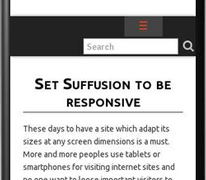
These days to have a site which adapt its sizes at any screen dimensions is a must. More and more peoples use tablets or smartphones for visiting internet sites and no
Continue reading...Dec 072014
 This new version address a single bug which I discovered myself. No one complaint about this issue so I was aware of it until I didn’t try to see this site on a mobile device with 480px width. But 480px is also my selected breakpoint from where the collapse menu need to replace the regular menu. But surprise, at 480px no menu was visible. The menu button was not yet visible but also the regular menu was still hidden. For exactly 1 pixel my site didn’t have any menu.
I realised that my logic in building media query which hide the menu button was wrong, hiding the collapse button too early, while Suffusion media query still not show the regular menu.
This new version correct this bug, covering this 1px situation.


