This version correct another bug which come with Suffusion and I wasn’t aware of it. At Suffusion Options -> Other Graphical Elements -> Navigation Bar Above (or Below) Header, instead
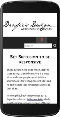
Continue reading... These days to have a site which adapt its sizes at any screen dimensions is a must. More and more peoples use tablets or smartphones for visiting internet sites and no one want to loose important visitors to their sites.
Knowing this, back to November 2012, Sayontan released Suffusion 4.4.0. which was the first responsive version of theme. Apart of other WordPress themes, in Suffusion the “responsivity” is an opt-in feature and is not enabled by default. Some people may prefer to have a good looking fixed site and visitors can scroll the site on mobiles.
Another characteristic, Suffusion don’t test the browser user agent for adapting the view on different devices. There are mobile devices with higher resolutions than common desktops screens. So, Suffusion display different views depending by the resolution of visitor screen. Using CSS and CSS media queries, the elements of theme are adapted to each resolution. Suffusion will not display another pages on mobiles than on desktops. The same elements (content, widgets) are arranged differently on each visitor screen.
Finally need to know that Suffusion responsive feature only HELP you to set the site for mobile, don’t MAKE the site responsive by itself. You need to think yourself the site for mobile devices. A responsive site presume to have a fluid content – without fixed elements – div’s, images, without tables. Need to prepare the header image if you use one as header foreground, also need to know that an image used as background of an element is not scaled with the element, but only cropped to the actual size of element. YOU will make the site responsive, the theme just give you some tools.
Step 1. Make your site fluid. A fixed element of 1000px will be displayed at 1000px on ALL visitor screens, the width cannot be adaptive. So, set “Fluid/Flexible widths” at Suffusion Options -> Layouts -> Default Sidebar Layout. Below set the “Maximum width” value as you prefer and the Minimum width to 0 (zero). I also always drag the slider for width to 100%. What’s means those values? They can be translated as: Make the width of the wrapper as 100% (or any value you’ve settled at Width slider) from browser viewport, but don’t exceed the “Maximum width” and don’t go below “Minimum width”.
For exemplification, let’s take a look at the default values which are 70% Width, 1200px Maximum width and 600 Minimum width. On a screen of 1366X768px will see the site at ~950px (1366X70%), but on a bigger screen like 1920X1080px, the width of the site will be 1200px (NOT 1920X70%=1344px, but the “Maximum width” value of 1200px). On the other hand, the site will be scaled down until the resolution of device reach 600px – below this resolution all devices will see the elements as they was fixed at 600px.
Now can see – by setting the site at 100% width is very simple to adjust the site for desktops – the Width will be equal with the Maximum Width. For mobiles, with 100% width, our site will fit all device screen.
The last thing you can set on that options page is the width of each sidebar. Keep in mind that on fluid layouts the width of sidebars remain fixed as is settled here, but only the width of main column is adjusted to respect the wrapper width.
If you use particular layouts for specific pages, don’t forget to make the same changes for any other particular layout you may use.
Step 2. Enable the responsive layout. Simply go at Suffusion Options -> Layouts ->Responsive Layout and tick the first option from that page. Below set the breakpoints from where the elements of the site are displayed differently. A good point to start is to let all presets as default, but only check “Resize header foreground images (logos) proportionately” if you use an image in foreground of header.
Later you can adjust everything on this options page in order to reduce the number of breakpoints for performance reasons. Each breakpoint introduce a new media query which increase the size of stylesheet.
Step 3. A bit of Custom Styles. Sometimes, when you start the customization of Suffusion with a fixed layout and only later switch to responsive&fluid layout, some of the elements remain with a minimum width of 600px. On all devices below this resolution, the site seems to not be responsive. I didn’t find a pattern, sometimes this happens, sometimes not. But is easy to address this issue by adding at Suffusion Options -> Back-end -> Custom Includes -> Custom Styles (the code try to cover all situations, not all elements are mishandled on all sites):
|
1 |
#header-container, #header-container .col-control, #nav-top, #nav-top .col-control, #nav, #nav .col-control, #wrapper, #page-footer, #page-footer .col-control, #widgets-above-header, #widgets-above-header .col-control {min-width:0;} |
Now, there are some minor bugs in the theme related to responsive layouts. Because of WPTRT policy, a new version of theme was hard to be released and these bugs wasn’t addressed. But is very easy to avoid them by using a bit of CSS.
First, the widgets from header or any horizontal widget aren’t hidden at any point, even if you select this behavior at Suffusion Options -> Layouts -> Responsive. This can be solved with a simple media query added also at Suffusion Options -> Backend -> Custom Includes -> Custom Styles:
|
1 2 3 4 5 6 7 8 9 10 11 12 13 14 |
@media screen and (max-width: 650px) { #widgets-above-header { display:none; /* to hide Widget Area Above Header */ } #header-widgets { display:none; /* to hide Header Widgets Area */ } #horizontal-outer-widgets-1 { display:none; /* to hide Widget Area Below Header */ } #horizontal-outer-widgets-2 { display:none; /* to hide Widget Area Above Footer */ } } |
The code will hide all described widget areas on any device with screen below 650px. Use only the part of code related to the widget area you want to hide. Also, change the breakpoint of 650px to any value you want.
Second, a bug in jQuery plugin which transform the menu to select list on small screens make visible 2 lists in Navigation Bar Above Header when both navigation bars are used. The first list is in fact based on the menu from Navigation Bar Below Header, which is repeated this way.
Again, a very simple CSS definition added at Suffusion Options -> Backend -> Custom Includes -> Custom Styles will solve the problem:
|
1 |
#nav-top .tinynav:nth-of-type(1) {display:none;} |
or
|
1 |
#nav-top .tinynav:first-of-type {display:none;} |
Finally, you can install my plugin Suffusion Collapse Menu which will replace the select list with a “menu button”, solving the problem of duplicated lists, but also solving a problem with “home” icon which in original select list disappear letting just a blank option instead.


