Equal Columns in Suffusion

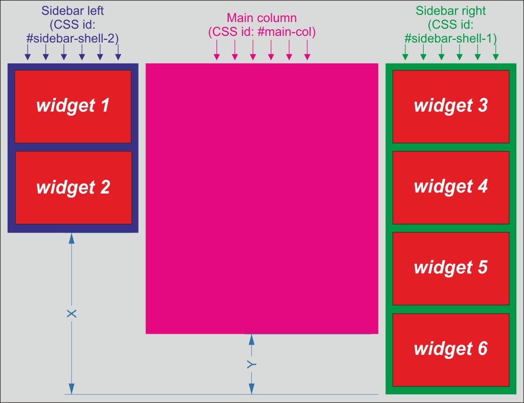
Usually the sidebars don’t have the same height as the content. Sidebars and main column are div’s and the height of a div is the sum of heights of its content. You can see the problem in the above image, where I made 3 columns with different content, so the the right sidebar is the taller than the main column which also is taller than the left sidebar which contain less widgets. But sometimes we need to have all columns of the same height, so the X and Y dimensions from image need to disappear. If all columns share the same color, the equal height problem is irrelevant, we can set the color of wrapper. But if you need different backgrounds for main columns and for sidebars, the problem will become visible.
For setting the color of main column can go to Suffusion Options -> Skinning -> Post Background. For changing the color of sidebars need to add at Suffusion Options -> Back-end -> Custom Includes -> Custom Styles:
|
1 2 3 |
#sidebar-shell-1 {background:#0F0;} #sidebar-shell-2 {background:#00F;} /*change green and blue from code above with your colors */ |
So, we need an automated solution to equalize the height of sidebars and main column, no matter how long is the content of each. And there are 2 simple solutions, easy to apply in Suffusion.
Solution 1. One True Layout
The most elegant and easiest solution come from old times, back to 2005, when Alex Robinson published his article In search of the One True Layout. This solution, based only on CSS, require to set an insanely large padding-bottom, compensated by a negative margin-bottom for each column from our design. All columns need to be wrapped in a container settled with “overflow:hidden”, to keep the large padding out of visibility.
The html markup needed for this transformation is already present in Suffusion, so, all we have to do is to add few CSS definitions at Suffusion Options -> Backend -> Custom Includes -> Custom Styles:
|
1 2 |
#container {overflow:hidden;} #sidebar-shell-1, #sidebar-shell-2, #main-col {margin-bottom:-30000px;padding-bottom:30010px;} |
This solution works in all modern browsers and the columns are also adjusted on mobile devices as you already can see on this site.
Solution 2. Javascript
Two years ago I changed the javascript of old WP Equal Columns plugin by Anthony Acosta, adapting it to Suffusion markup. So, you can add next code at Suffusion Options -> Backend -> Custom Includes -> Custom Footer Javascript:
|
1 2 3 4 5 6 7 8 9 10 11 12 13 14 15 16 17 |
var ddequalcolumns=new Object() ddequalcolumns.columnswatch=["sidebar-shell-1","sidebar-shell-2","main-col"] ddequalcolumns.setHeights=function(reset){var tallest=0 var resetit=(typeof reset=="string")?true:false for(var i=0;i<this.columnswatch.length;i++){if(document.getElementById(this.columnswatch[i])!=null){if(resetit) document.getElementById(this.columnswatch[i]).style.height="auto" if(document.getElementById(this.columnswatch[i]).offsetHeight>tallest) tallest=document.getElementById(this.columnswatch[i]).offsetHeight}} if(tallest>0){for(var i=0;i<this.columnswatch.length;i++){if(document.getElementById(this.columnswatch[i])!=null) document.getElementById(this.columnswatch[i]).style.height=tallest+"px"}}} ddequalcolumns.resetHeights=function(){this.setHeights("reset")} ddequalcolumns.dotask=function(target,functionref,tasktype){var tasktype=(window.addEventListener)?tasktype:"on"+tasktype if(target.addEventListener) target.addEventListener(tasktype,functionref,false) else if(target.attachEvent) target.attachEvent(tasktype,functionref)} ddequalcolumns.dotask(window,function(){ddequalcolumns.setHeights()},"load") |
The original plugin load the javascript in header and I think is better to be loaded in footer for avoid negative impact to loading page speed.
This solution will work correctly only on sites with fixed width or on sites where you hide the widgets on smaller screens, otherwise, if you move the widgets below the content, will have a gap between content and widgets, or after widgets, depends which column is taller.
Can see a site where I used this technique: https://www.bhzn.nl/.
The solutions above are just theory, depending by your configuration probably you will need small adjustments either of codes from article (by eg. if you have 2L or 2R Sidebars will have to address #sidebar-wrap instead of sidebar-shell’s) and probably you will have to adjust margins/paddings for other elements too, as for footer or wrapper, but for sure you have now a starting point.

